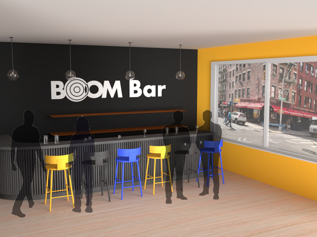
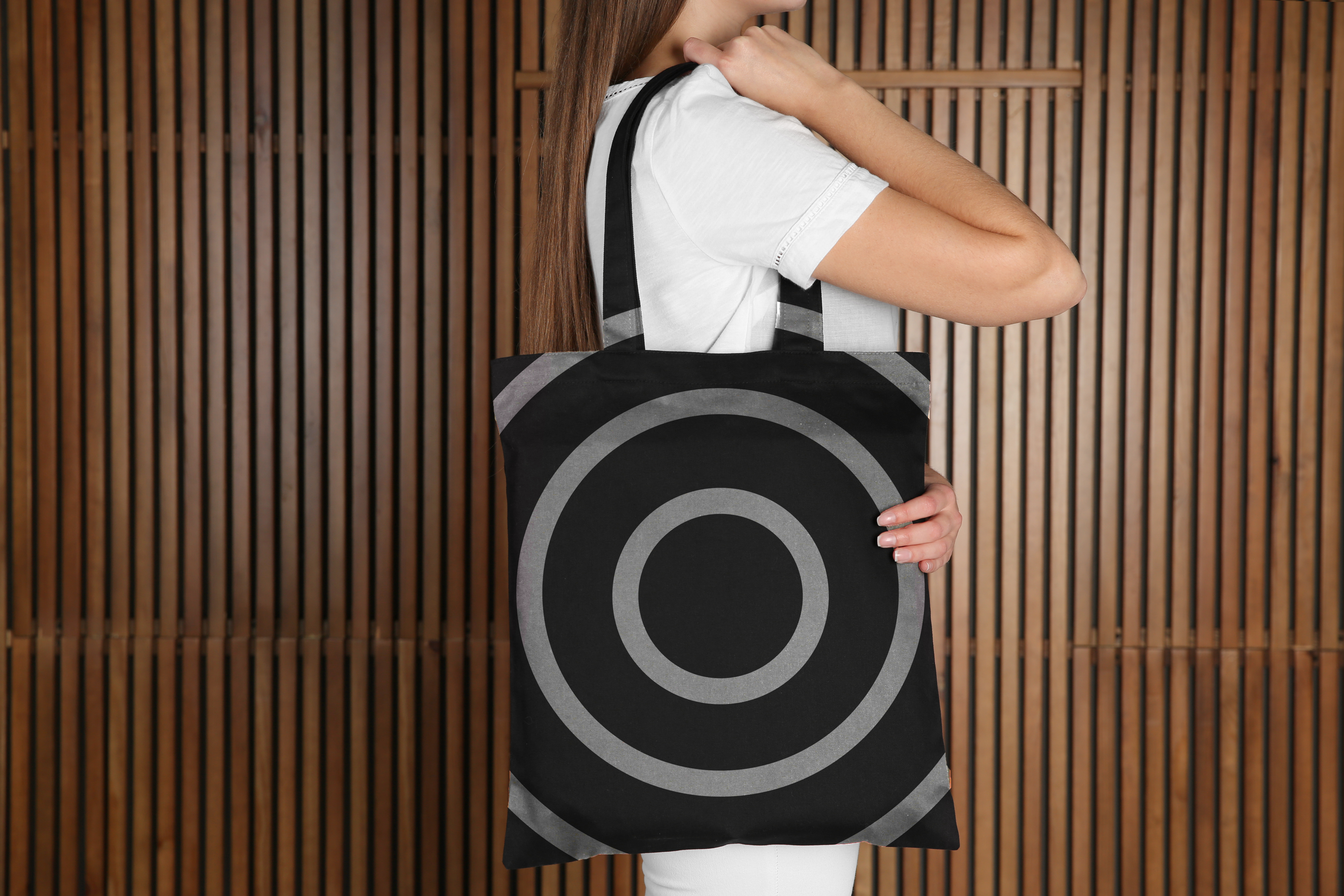
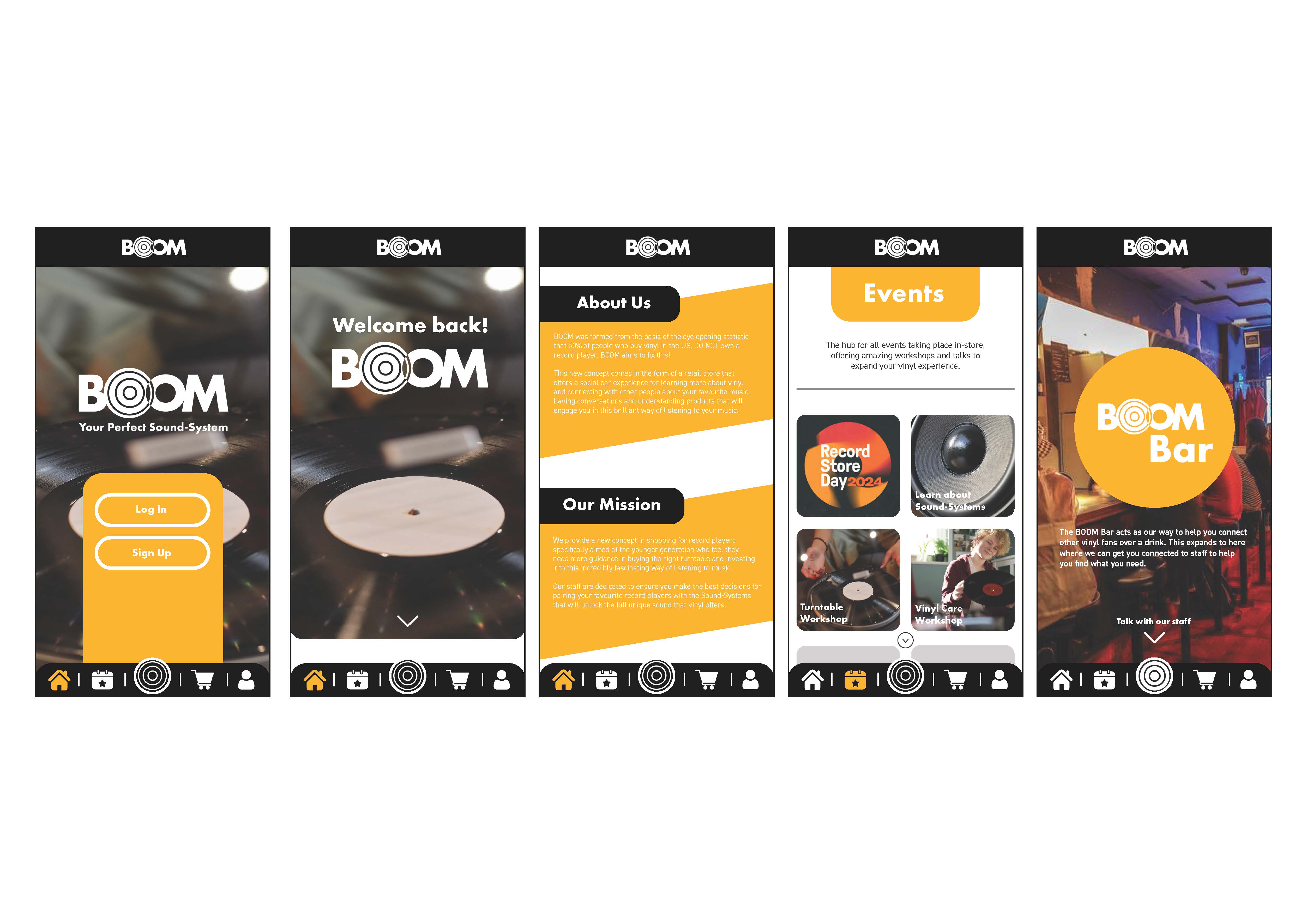
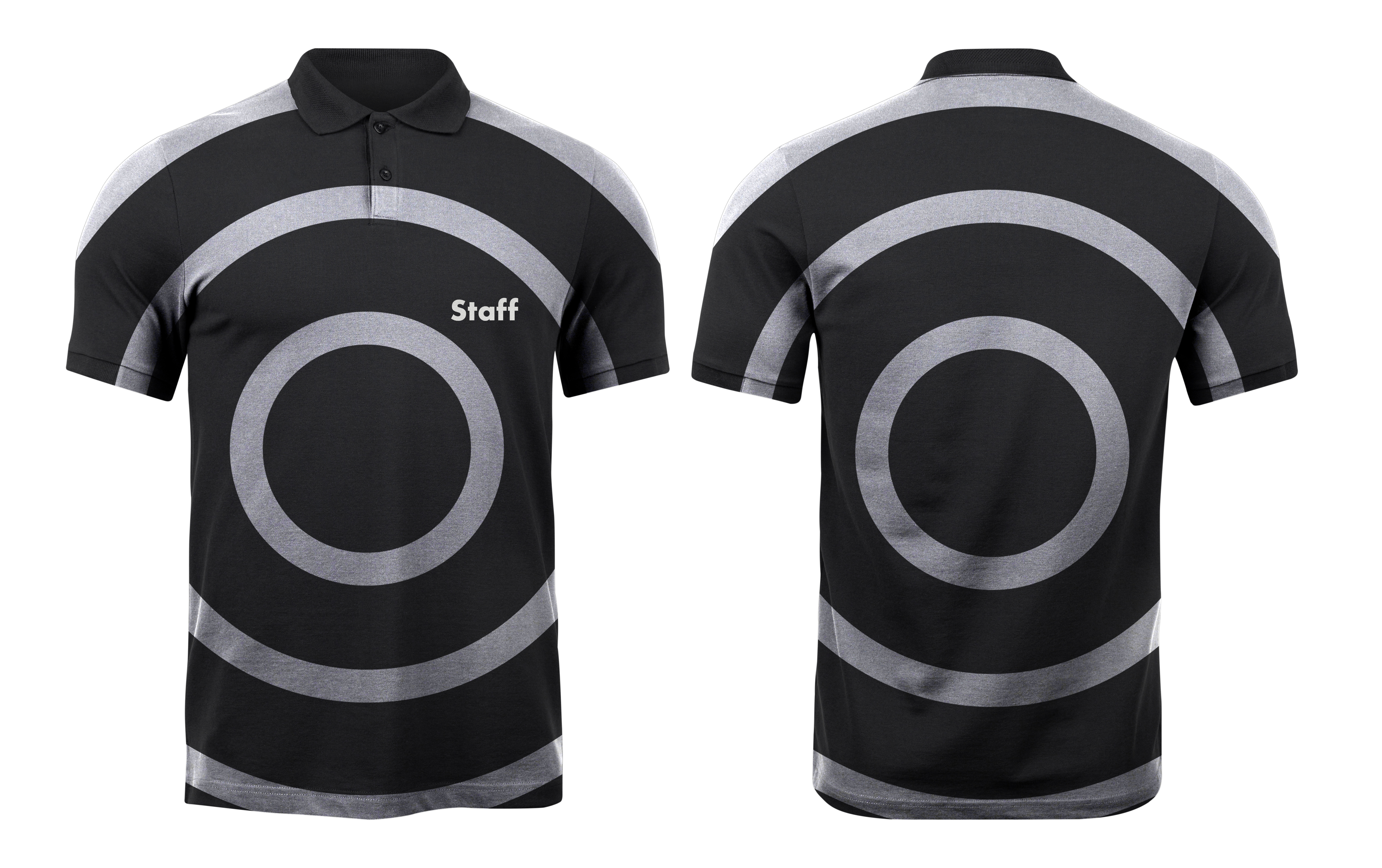
BOOM
This new concept in the record player market gives Gen Z audiences a space to be able to learn, invest and talk about their interest in vinyl as a result of the resurgence. This comes in the form of a more youthful catered shopping experience as well as a social bar that will help them talk about music and take part in events and workshops to help them learn more about vinyl culture. The BOOM name and logo was chosen to have sonic representation with boom being a very impactful noise but also convey the idea of size and scale, reaching out to a new audience who needs guidance in this market exploring a resurged way of listening to music.
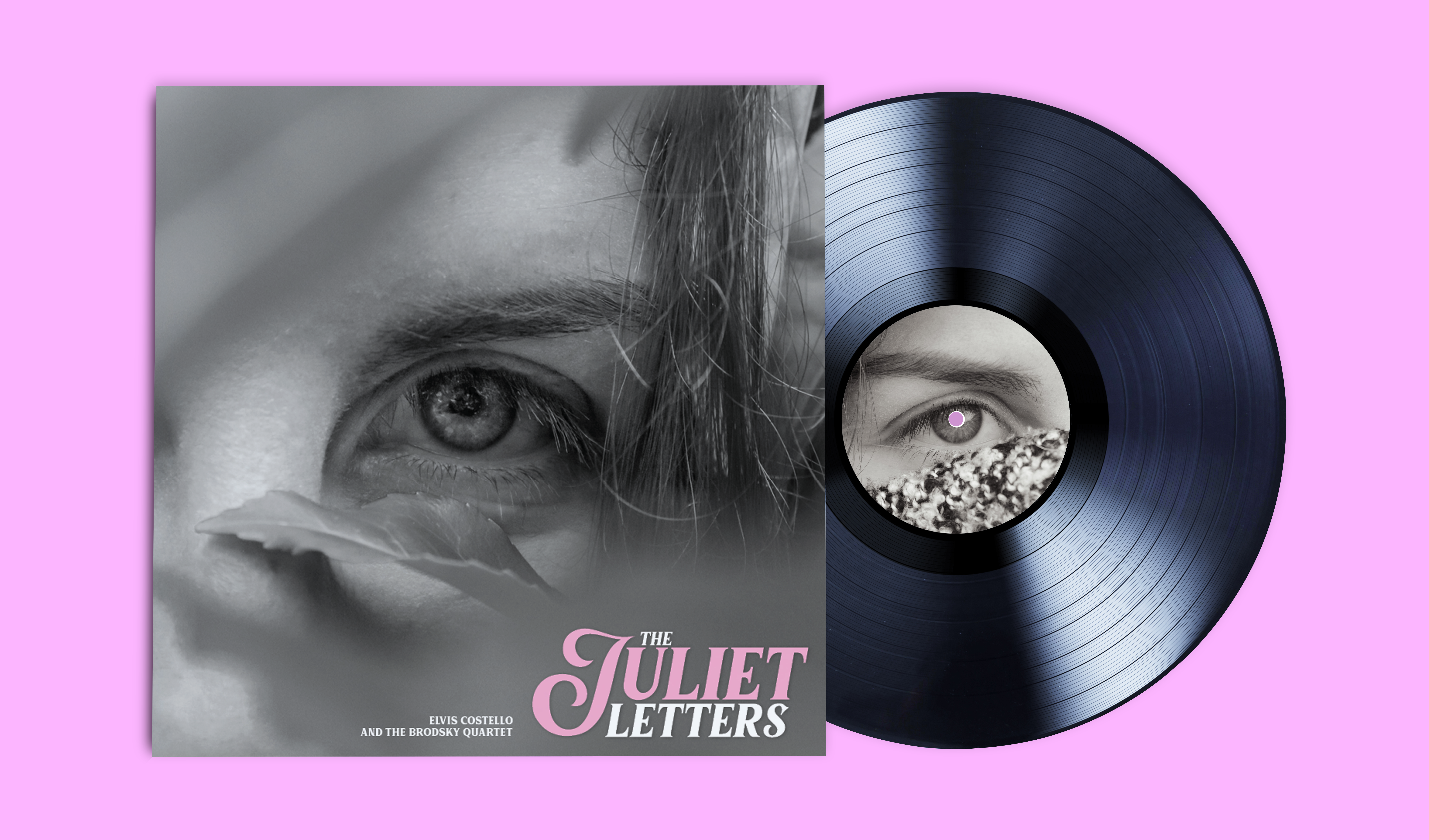
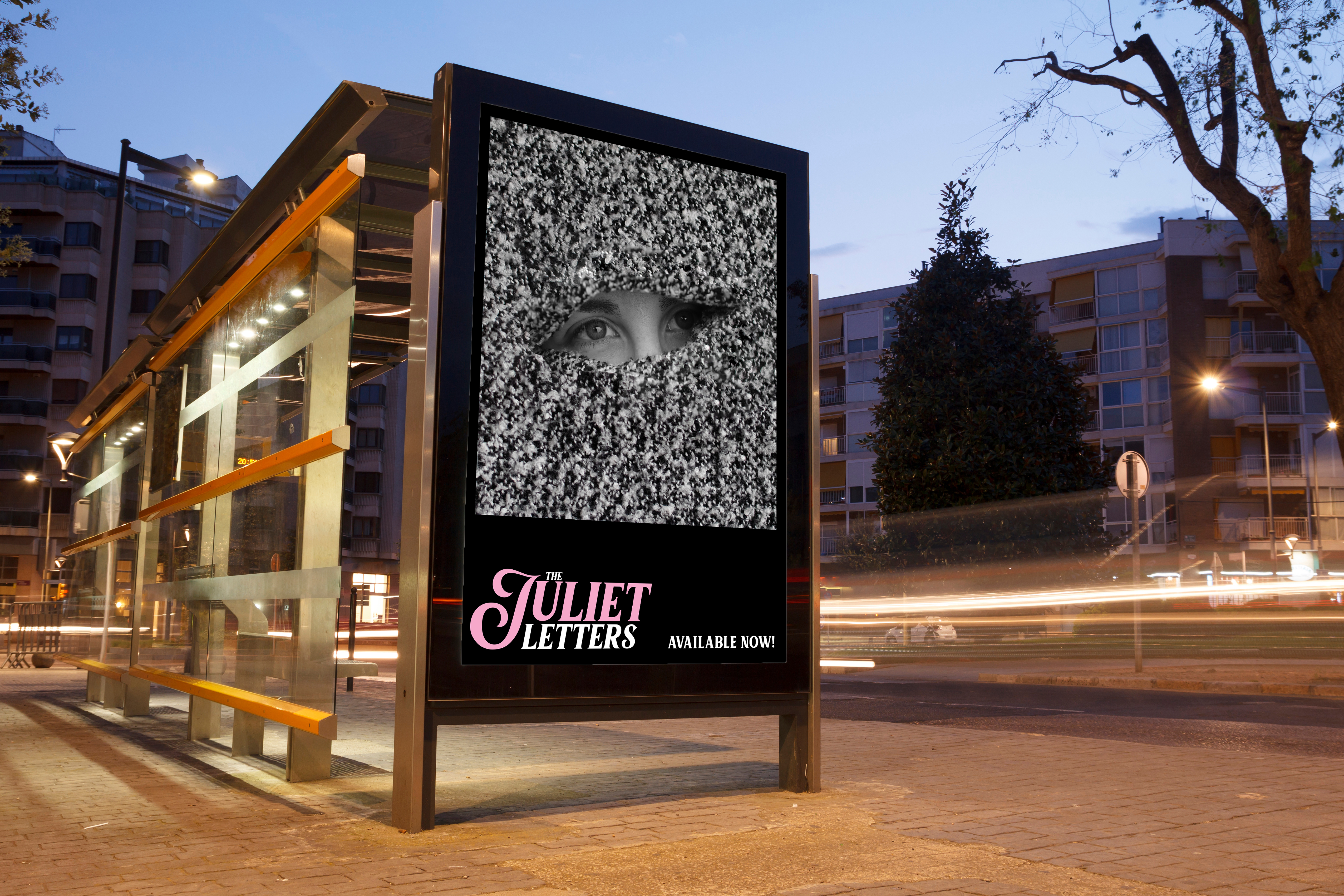
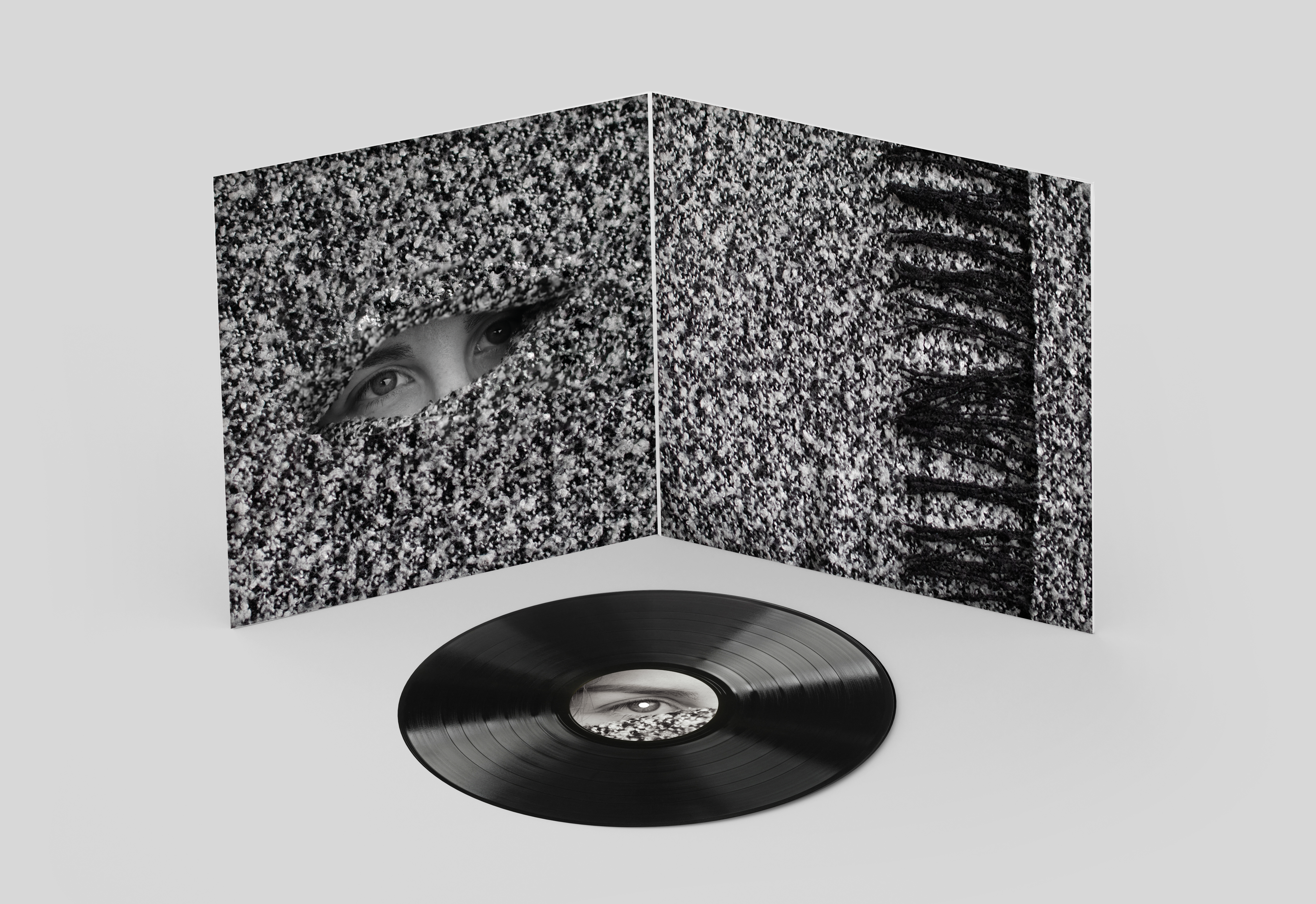
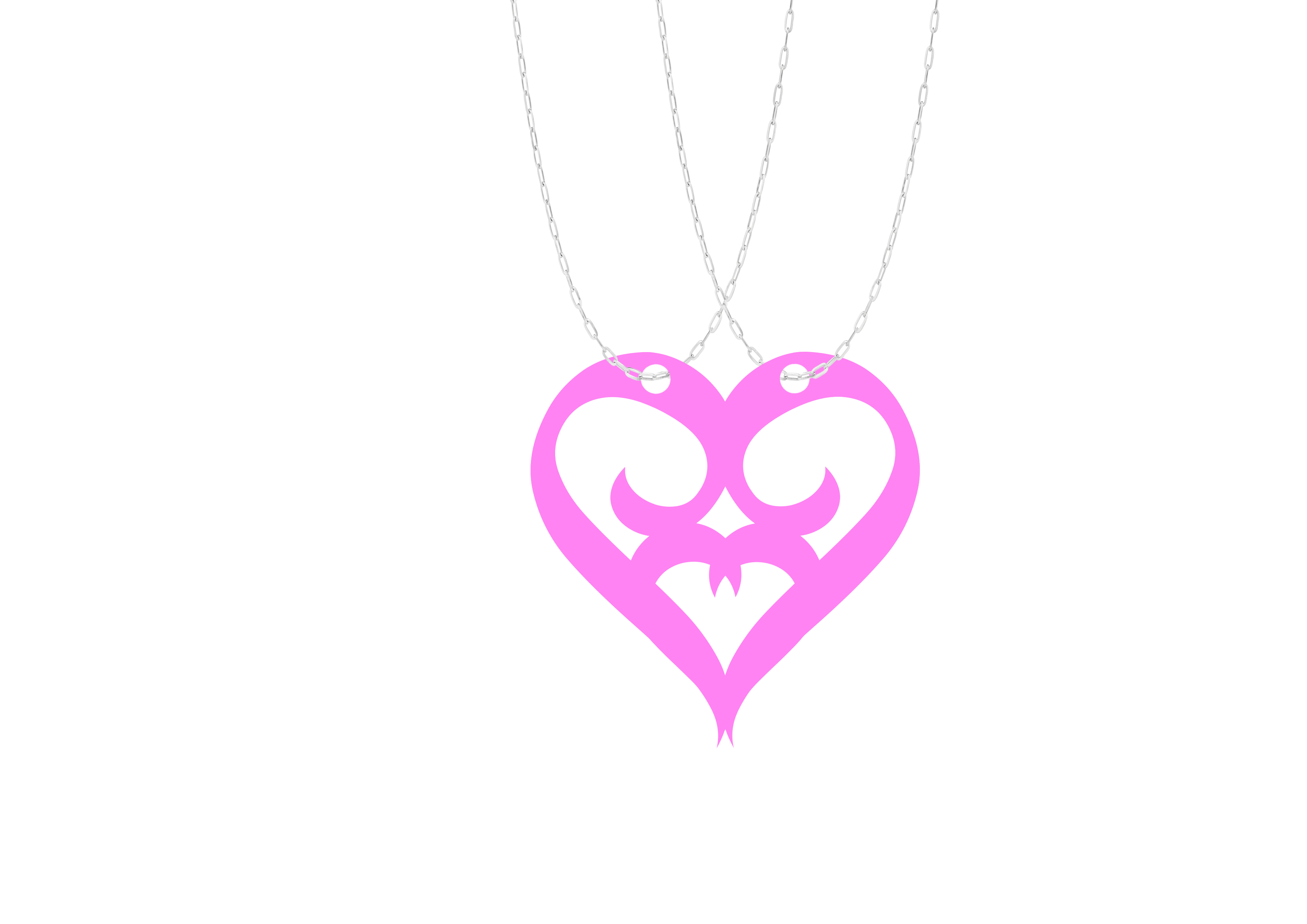
The Juliet Letters
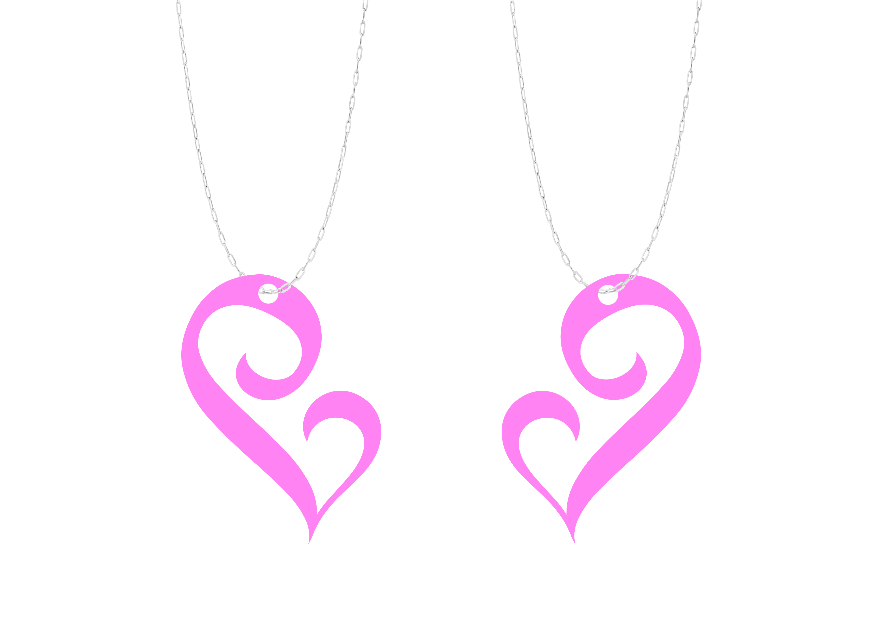
This redesign of ‘The Juliet Letters’ aimed to bring out more of the meaning behind the album with a large amount of the lyrical content being love, loss, longing. The main imagery for this album cover is a longing eye, obscured to represent the idea of looking at someone longingly from afar and in secret, hoping to catch a glimpse and the desire to want something you can’t have. With the main themes of the album linking to love, I wanted to make a friendship necklace to go along with the album that takes the first letter of Juliet to make a heart when put together.